The E-shop of Zámecké vinařství Bzenec is now available at the new address www.meziviny.cz. Your original login credentials remain valid. More information at eshop@meziviny.cz.
![]()
EN | CZ
ZVB collection
The basic range of quality wines for everybody
The series of wines that was created by redesigning the original Moravian Classic series, in a new modern design now. These wines, pleasantly drinkable, are the basic series of the company that offers high-quality wines made from Moravian grapes with slightly increased residual sugar.
When design should be more modern, it should also respect the place where we are. The label bears such elements that are not apparent at first sight; but taking a close look at them you can see several interesting details. The graphics are dominated by the open peacock tail; it cannot also be missed during a personal visit to the local castle park. An observant customer can also notice the wooden wine barrel, hands, sun, castle key, peacock head, and vineyard rows that twine round individual feathers in the graphics. All of these symbols are not only the picture of the place where we are based but they also represent the main elements without which the viticulture craft cannot make do.
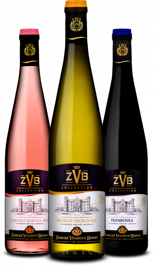
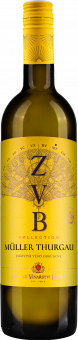
Yellow labels have been selected for white wines; this colour is positive, shining and sparkling. Elegant dark grey is for red wines, restrained light pink for rosés, of course, and cuvées have a modern light grey design.
The graphics of the original label was designed by the prestigious London graphic office Claessens. Redesign was in the hands of the Brno graphic designer Aleš Sadil, who has designed many successful and award-winning labels.
The most valuable awards
-

Year 2022|2020|2019|2017|2015|2014|2013|2011
-
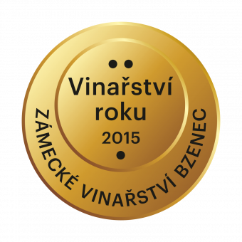
2015 - absolut winner, Winner of the large wineries category, The voice of the public
-

2016 - absolute winner
-

2021 - absolute winner
-

2021 - absolute winner | 2020 - 5-star winery |2019 - absolute winner | 2018 - absolute winner | 2017 - 5-star winery | 2016 - 5-star winery
-
2019, 95 POINTS, Czech White Trophy
-
2019 – Platinum medal, 96 POINTS | 2016 – Platinum medal, 95 POINTS
-

2019 - Champion white, Grand Gold
© 2011 – 2019 - Zámecké vinařství Bzenec s.r.o.
Vytvořili: SuperKodéři
Podle zákona o evidenci tržeb je prodávající povinen vystavit kupujícímu účtenku. Zároveň je povinen zaevidovat přijatou tržbu u správce daně on-line; v případě technického výpadku pak nejpozději do 48 hodin